RU
RU EN
EN CN
CN

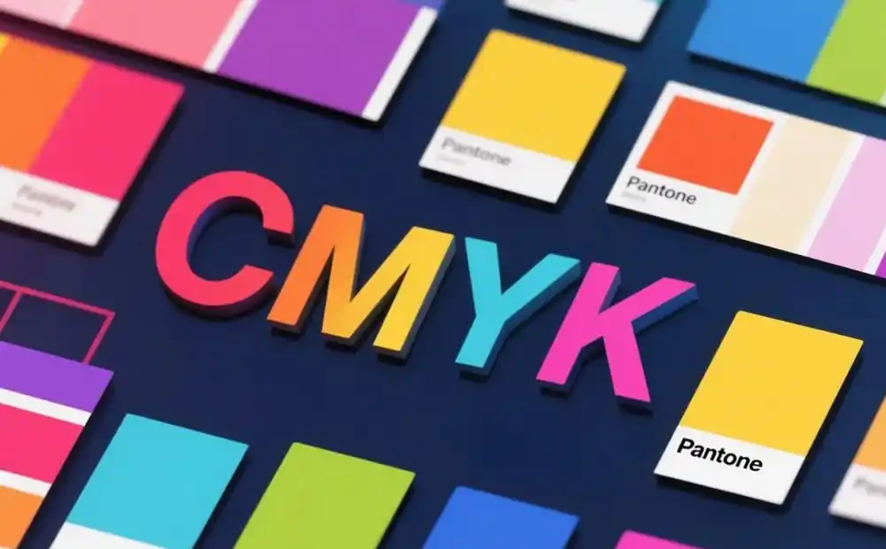
1、What is CMYK?
CMYK stands for Cyan, Magenta, Yellow, and Black. It uses a subtractive color mixing model, where the principle is based on the combination of these four inks. By adjusting the percentage of each color, printing machines can simulate millions of different hues. This makes it particularly suitable for printing full-color images such as photos and complex graphics, which require a broad color gamut.In practical applications, CMYK is commonly used in color magazines, brochures, product catalogs, and packaging printing. Its greatest advantage is strong versatility, as it is compatible with most printing equipment. For large-scale commercial printing projects, CMYK not only meets requirements but also saves costs.
However, CMYK has limitations. One major challenge is poor color consistency control—the final printed color can be affected by factors such as paper type, ink quality, and even printing machine settings. Therefore, achieving identical colors across different printed materials is highly difficult. Additionally, CMYK has a limited color range and cannot accurately reproduce extremely vibrant or bright colors.
2、What is Pantone (PMS)?
The Pantone Matching System (PMS) is a standardized spot color system. Its strength lies in achieving precise and consistent color reproduction through pre-mixed inks. Unlike CMYK, which mixes four primary inks to create colors, Pantone uses a series of spot colors, each with a unique number.Each Pantone color is carefully formulated to correspond to a specific hue. It features a comprehensive color swatch library with over 1,800 different colors, each assigned a unique name and number. For example, Pantone 186 C is a famous red often used by brands in logo design and marketing materials. By specifying a Pantone color number, designers can ensure that the color on the final printed product matches their vision almost exactly.
Pantone is ideal for scenarios requiring high color accuracy and consistency, such as brand logo printing, packaging design, and high-end advertising. It is also widely used in industries like fashion, textiles, and graphic design, where precise color matching is core to creating professional and unified visual effects.
The advantages of the Pantone system include high color consistency—its inks are pre-produced according to color standards, resulting in far fewer color discrepancies than CMYK. This ensures uniform colors across all printing materials, regardless of location. Moreover, Pantone offers a wider color gamut than CMYK, providing designers with more creative flexibility.
However, Pantone has drawbacks, most notably cost. Since each Pantone color requires a separate ink, printing multiple Pantone colors can be significantly more expensive than using CMYK. Additionally, its color swatch library has a limited number of colors, making it difficult for designers to reproduce certain specific hues.
3、Key Differences Between CMYK and Pantone
| Characteristic | CMYK | Pantone (PMS) |
|---|---|---|
| Color Type | Process colors | Spot colors |
| Color Accuracy | Varies by printer and materials | Highly consistent |
| Customizability | Limited by color gamut | Over 1,800 specific hues |
| Cost | More economical | Higher cost per color |
| Best Use Cases | Photos, complex images | Logos, brand identities, solid color fills |
| Color Reproduction Variability | High | Extremely low |
The most fundamental difference between CMYK and Pantone lies in their color types. CMYK generates colors by mixing four primary inks, making it a process color system, while Pantone uses pre-mixed spot color inks, classifying it as a spot color system.
Customizability is another key factor. CMYK has a limited color range and struggles to accurately reproduce extremely vivid or bright colors. Pantone, however, offers a richer selection of unique spot colors, allowing designers to create more distinctive and recognizable designs.
Cost is also a critical consideration. CMYK can print multiple colors using a single set of plates, making it much cheaper for large-scale commercial projects. Pantone, by contrast, requires a separate ink for each color, significantly increasing costs for multi-color printing.
Finally, their optimal applications differ. CMYK is suitable for printing photos and complex images, meeting the need for rich color ranges in general commercial prints. Pantone excels in scenarios demanding strict color accuracy and consistency, such as brand logos, packaging, and high-end advertising, and is widely used in fashion, textiles, and graphic design.
4、How to Choose Between CMYK and Pantone?
When deciding between CMYK and Pantone for a printing project, several factors must be considered: project requirements, brand color consistency needs, budget, and printing methods.- Project Requirements
- For projects involving full-color images like photos or complex graphics, CMYK is usually the better choice, as it can reproduce rich colors and intricate details.
- For projects requiring high color matching precision, such as brand logos or packaging, Pantone ensures accurate and consistent colors.
- Brand Color Consistency
Maintaining color consistency is key to building a strong brand image. For large-scale brand promotion campaigns or materials that need to match other brand assets, Pantone’s high color accuracy and consistency make it the first choice. Using the same Pantone color number across all printed materials ensures a unified and recognizable visual identity. - Budget
CMYK has a clear cost advantage in large-scale commercial printing, as it can handle multi-color printing with a single set of plates. Pantone, with its need for separate inks per color, is more expensive for multi-color projects. If budget is limited, CMYK is often more practical; if color accuracy is paramount, investing in Pantone may be justified. - Printing Methods
Different printing methods (e.g., flexographic, gravure, digital, screen printing) have varying capabilities for color reproduction, which can influence the choice between CMYK and Pantone.
Examples:
- Brochures: Typically containing full-color images and text with moderate color accuracy requirements, brochures are well-suited for CMYK, which balances rich colors and cost-effectiveness for large-scale printing.
- Brand Logos: As the most recognizable element of a brand’s visual identity, logos demand color accuracy and consistency. Pantone’s precise color reproduction ensures uniformity across all applications.
- Packaging: Design needs vary for packaging. High-end brands or products with unique color schemes may require Pantone for precision, while packaging with full-color images or complex graphics may favor CMYK. In some cases, combining Pantone spot colors with CMYK process colors can achieve optimal results.
In summary, choosing between CMYK and Pantone requires a comprehensive evaluation of multiple factors. By understanding the characteristics and differences of these two color systems, designers and printing professionals can make informed decisions to achieve ideal color effects and produce visually appealing, professional printed materials across all project types.